CHROMATICS FINE ART PRINTING STUDIO
CHROMATICS FINE ART PRINTING STUDIO
Working at Chromatics as a print production specialist has allowed me to deeply learn and understand the heart of the brand. When I joined the team a year ago, Chromatics was operating under new management, but an old logo: one that had been used since their inception in the 1980’s.
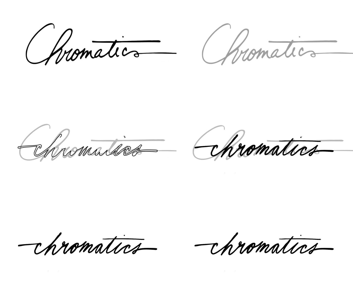
The goal for this project was to rebrand, refresh, and restore. We settled on having a suite of logos: a sans serif, contemporary header for site and social media, an eye-catching “C” that represents the use of the CMYK color gamut, and a cursive signature that mimicked the old logo, to retain a bit of heritage.
Old vs new signature
Showstopping photos by Victoria Quirk


